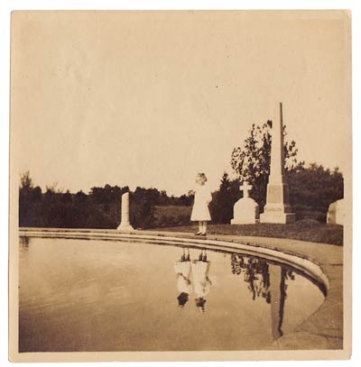
Research. The Constructed Image.

Willie Doherty


Willie Doherty was born in Derry, Northern Ireland in 1959 and so he is an Irish photographer who is best known for his photo series, in which, he combines his work of black and white landscapes and/or cityscapes with text. He is a twice turner prize nominee and a lot of his work represents struggles from his childhood.

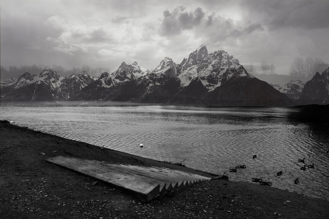
The work of Doherty’s work is to make you believe, think and feel things through the image. He combines the use of sensitive words, like “isolate”, “unseen” and “mute”. It is on top of black and white imagery to create a desolate and dark atmosphere.

He lives in County Donegal and still continues to work in Derry.

Doherty utilizes a camera and Photoshop to create a selection of photographs that work well together as a series to be extremely striking and moving.

I enjoy his work as it appears to be rather “simple” with the composition, making it interesting and extremely compelling. The photographs are also in black and white, making the pieces he creates even more moving and compelling. The text completes the photographs and adds to the meaning, making you think more into the meaning.

Willie Doherty has in the past, remarked that his aim was ‘to try and reflect the way the terrain creates an understanding of the place’.

The ‘place’ named in much of the work in this introduction is Derry, the artist’s home town.

In his work, “representation is a question of positioning: the camera in relation to the object, the text in relation to image, the viewer in relation to the physicality of the photographic installation.”

“‘Place’ is not simply a named topographical entity. It is a position from which I see and am seen: a relation that is both specular and spatial, and which produces an image of myself through the ‘other’ of my gaze. The terrain that Doherty maps is a labyrinth of complex relations with this ‘other’, through whose narratives of the social and the political, the psychical and the historical, the human subject constructs its sense of identity.”

Though his images appear to be simplistic, when looking deeper, the images he has created are a lot deeper than thought, however, due to the words represented throughout his work, it is hard not to see that there is undeniably a meaning throughout.

I can defintley say that Willie Doherty’s work has had a great impact on my work. He uses strong and bold type, mainly in white to juxtaposition with his black and white backgrounds. He usually uses one word throughout, but he has been known to add more words. Directly in the middle, going across the photograph in large type, however, you are still able to see the image behind and with the words in contrast to the greay tones matches well, giving off a slight lonely feeling due to there being no people involved, there is no colour and there is a sense of mystery, with each landscape being different.


Research.

When researching for this project, for both the commercial side of Object of Desire that I wanted to look into, however, I want some of my images to be on location as opposed to the normal studio images. I came across this advertisment campaign that was actually advertising Adidas.

Even though I believed that these are good for inspiration on my Object of Desire side of the project, I also look at this as a good inspiration for Constructed Image as I have been meaning to use words in my images.

In these images, it is clear to see that the images are to “normalize” females doing exercize and there appears to be a perception of perfection in the modern age nowadays shown through television, magazines, radio, billboards etc. These images show that and combat that throughout.

Despite these images being different to what I want to do as a whole, I appreciate the ideas behind it and the type. The type is striking, but it is spread across the whole of the photograph (not always) but, its cleverly made and I think I will take this and look into doing that.

“I jiggle therefore I am” – this based off of a “Barbara Kruger” quote that has been used before in her posters – “I shop therefore I am”. Her work is mainly based on feminism and materialism, love and community.

The slogans in this Adidas advertisement are punchy, using punctuation and this is something I wanted to take from it due to wanting a “straight to the point sentence”, easy to remember, which is a good strategy in advertising. I want to use one word in my Constructed images.

In these images, a camera, a reflector & flash gun has been used due to the person being clearly shown. Fast shutter speed, freezing the movement.


Thoughts so far.

I have been thinking of what direction I am going to take my projects.


Objects of Desire.

This project has truly been a hard one for me to crack, ultimately my mind is thinking of taking “Object” of “Desire” literally and looking into the commercial side of things and finding different ways to make the object appear desirable. One way I look into doing this is with lighting technqiues, by the way light hits the object.

I want to try shooting with natural lighting also, on location shots with quite desirable backgrounds, which is what I have already been experiementing with such as, the perfume and port at the beach.

However, something I have also been looking into was the idea of reflections and a person looking into the water or a mirror and it reflects what the person desires most, and yet to the audience, it could have a different meaning.

This image is taken from the book/movie “Miss Peregrines Home for Peculiar Children”

I am unable to find out the photographer or creater of this image but I found great inspiration from it in this idea.

c926132d00a1a505ad98970d82ff322b


The Constructed Image.

For this project, I have wanted to use photoshop and look into the different effects this can take on images.

Another thing I have looked into was using photographs taken from google mixed with my own images, such as this image that I created on photoshop:

ANSEEEEL.jpg

The image of the Mountain is purely Ansel Adam’s photography, however, I rubbed away the bottom of his orginal photograph and used my own photograph of the lake and stairs.. However, if I was to look into doing this, I would use photographs that no longer have copyrights.

I do really like this idea, however, something I have also wanted to look into was using type in my images, which is something I am defintley going to try.


Enigma of Time.

I have had a lot of ideas for this project, some including the idea of using shutter speed, creating dancing ghostly figures. Another to create unusual photographs made to look vintage.

Something that has inspired me throughout these ideas is the photographs taken from the book / movie “Miss Peregrines Home for Peculiar Children”

Again, I have been unable to find the creater / photographer of these images.

To which, I have taken photographs that I have begun to edit.

Something I looked into was the meaning of “Engima” which is “a person or thing that is mysterious or difficult to understand.”

And so, I want to create quite mysterious images. The idea of the person in the photograph being transparent, as if they are a memory.

Photoshoot. Enigma of Time.

Here are some of the original photographs I took.

Here are a few of the edited versions of this photoshoot:

This slideshow requires JavaScript.

These images were taken for my project “Enigma of Time”, in which, I wanted to create “typically vintage looking images” with a warm tone to them as well as adding grain to it. It was obvious when I looked more into vintage images, or evn recreated versions of vintage images, that they are black and white, but I liked the idea of experimenting with a sepia effect.

My idea behind this photoshoot, was to make the people who are in the images to look as if they are memories, and that they aren’t truly there anymore. By doing this, I wanted to make the people rather transparent. I used photoshop to help create the colour tones and the transparency of the person taking place in the images.

I personally believe that I did accomplish my idea rather well, due to the idea of them being memories coming across.

Photoshoot. Objects of Desire.

Here are some edited versions of this photoshoot:

This slideshow requires JavaScript.

This is another item that I wanted to photograph with a desirable background, however, instead of using the sea for this item, I looked for other areas. One of the places I thought to use was a restaurant, that had a lot of warm tones to it, with the lighting to create a very pleasing and somewhat rustic image. I really believed that this was an inviting image due to not only the warm tones but the colours coming from the flowers.

Moreover, another place I looked at photographing, was on a wall, that was overlooking a boat dock, leading to mountains. To the left there happened to be the sun setting and to the left was the town.

The mountains gave off a very soft vibe with a lot of soft colours (many blues). I worked with photographing it at different angles, and favourtising a specific vantage point which was with the chanel bottle directly to the middle of the image.

The sunset images gave off a warm vibe, and due to the fact that it was a shallow depth of field, with the background being blurred, it meant that the background was intruiging and added an extra element of colour to the image, yet the eye is on the actual desirable object as it is in clear focus.

I also appreciated the way the Chanel bottle looked in front of the town as it was a very warm and inviting image, and yet still, the focus is still on the Chanel bottle as it is the only part of the image that is in focus.

I specifically photographed these images with a shallow depth of field as I wanted the “Object of Desire” in clear sight, with the idea that you could be in a “warm inviting” area when you have the object, a way of escaping reality.

Photoshoot. Objects of Desire.

These are a few of the many photographs I took of this bottle of port.


Some edited versions of these photographs:

This slideshow requires JavaScript.

I began thinking about different ways I can take photographs of items that can be perceived as desirable to people, and one of the ideas I had was photographing objects (such as this Port bottle) with a background that looks desirable too.

One of the “desirable locations” I had in mind was the beach, and the areas around the beach, this is a place that people often seek to get away from reality, on holiday for a short break so I believe that this will evoke something in the viewer as well as the actual item.

I decided on using a bottle of Port as it is also something that can be used to take people away from “reality” and despite it not looking desirable to everybody, a lot of people drink this substance and I really liked the shape of the bottle and the colour that it gives off, especially when the sun was glowing through.

Photoshoot. Objects of Desire.

This photoshoot was purely for experimentation, looking at the way the light passes through the clear seahorse orniment. I also liked the idea of using the sea in these images due to the idea that this is something the seahorse desires, to be home.

I defintley experimented with natural lighting in natural areas with this, along with the angle I wanted to take the photograph.  There is a few of my images here that can be seen as too dark or too bright, but I am rather happy with the way a few of these images turned out.

Photoshoot. Objects of Desire.

For one of my ideas, I looked into doing a slight documentary look onto the Objects of Desire, by walking around and photographing things and situations as a starting point for this project.

I went on a day trip to Wales and found lots of different buildings and places that were desirable to local people as well as “tourists”, such as, the simple ice cream parlor.

I went on to take a photograph of the actual ice cream, to see what effect this would have as this was the desirable object that some people purchased at the seaside.

Despite the fact that I didnt like this idea due to there being no structure, I am glad I tried this to see how it would look and purely for experimentation.

Workshop.

A clean sheet.

The date was the 28th of Febuary, 2019, when we had a look into this workshop. We were told to use paper and create minimlistic or effective images, mainly in any way we wanted to, mainly to experiment.

When it came to my turn for shooting the paper I had created, I experiemented with lighting, to get it right at first, and the eventually added the gels and the gobo.

This was an extremely creative workshop as it really got us to thinking about what to shoot, how to shoot and where to shoot it. The introduction to the Gobos was really helpful and was interesting, creating fascinating patterns on the subject.


Throughout the experimentation of the lighting, which went from too bright, to too dark, and then just getting it right, from the blur to the focus, I eventually found ways of working that I really liked, such as the blur and the pink on either side of the structure or the different angles I was able to take.

I thoroughly enjoyed this session and believe it was a really helpful way of looking into more creative and somewhat minimlistic ways of using photography.

Workshops.

Speedlighting.

It was on the 29th of January that we used and learnt about speedlights for the very first time. At the start of the workshop, it was amazing to see the types of effects that speedlights can have on images, truly amazing without even realising it, truly showing the different ways of working. After learning, we were about to try it ourselves and go around the areas, lighting different places with the speedlights.

On this day, we found a dark / shadowed area by the food machines and decided to make it quite a compelling image.

I have decided to buy my own speedlight and radio trigger to use whenever i would like on my own photography as I find it such an interesting and amazing way to use photography to my advantage.

Our second Speedlight session in Febuary was giving us the chance to revisit the speedlights and what more it can do in photography. We used them in more areas around the university, on different people around as well, creating amazing images, showing what speedlights can truly do.


High key lighting.

In one of our studio lighting workshops, we worked on high key lighting and how to create it, which I found extremely informative and helpful. We were aloud to pick specific photographs using lighting and we decided on this image.

52146446_10157313195251614_320832150045720576_n.jpg

I really liked the effect it had on the face, a soft yet sharp image, with the eyes rather striking. We used two lights facing the backdrop to create the highkey effect and when it came to the soft yet well lit effect on the persons face, we used a huge soft box, to which I stood in front of it to take the image (which is why it is clear to see the photographer in the models eyes)

Here is the image that I took after a few trial runs, we eventually were able to recreate this image, from the blur to the background to the slight shadow on the left side of the face, enough to be seen but not enough to be sharp and harsh on the face.

52141278_10157313195171614_4791919321662095360_n.jpg