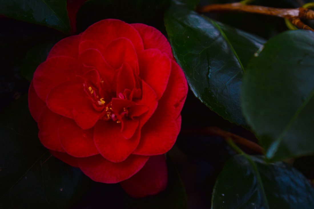
My final photographs.
Objects of Desire.
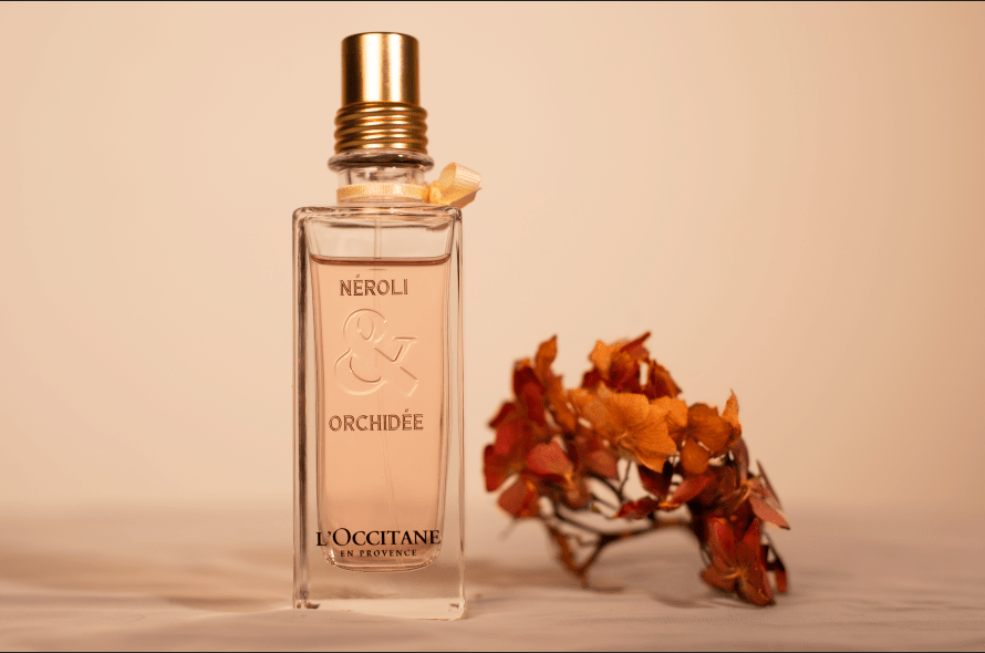
Image 1. (Perfume)
Here I used studio lighting (a soft box and a key light). My ISO was set at 200. My Shutter Speed was 1/125 and my Aperture was at around F8. I wanted to try advertisement in these images. I found it extremely confusing and tough to come up with ideas for this project but I had ended up deciding to take this project literally and take literate Objects of Desire and making the actual image desirable.
I wanted to use studio lighting to experiment with studio lighting and white balance, to make the image soft and have pastels involved, just as the photographers I researched. I decided to add flowers to give a visual representation of what the perfume smells like, with a sense of warmth to the photograph.
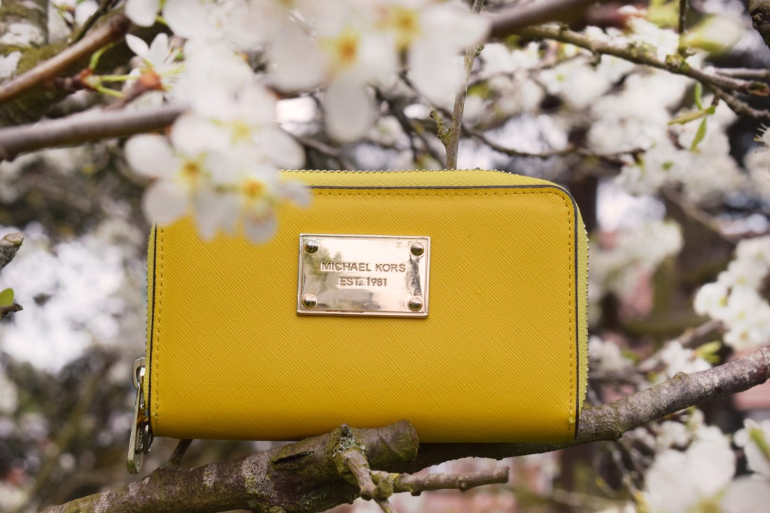
Image 2. (The purse)
Here, I used natural lighting. ISO: 200/100. (?) The shutter speed: 125/160. Aperture: about F11?
This is another image I wanted to make soft, I had used natural lighting. I wanted to have a delicate effect on the image due to the delicacy of the petals in the image, and due to the fact that the purse is in focus whereas the blossom is blurred out, creating more of a soft effect. The purse colours corresponded well with the colours from the nature surrounding it. It was created to become a desirable image. I had brightened the flowers for desire, with the idea of taking commercial out of the studio to bring natural effects.
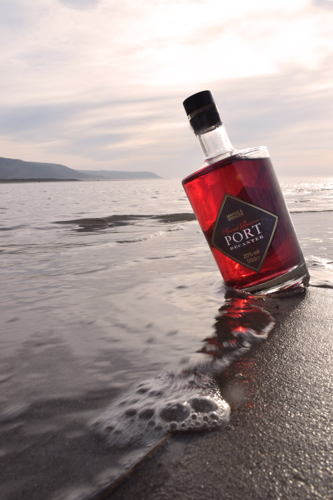
Image 3. (The port.)
I again, used natural lighting. ISO – 200. Shutter speed – at about 125. Aperture – F5.6 / F8.
I wanted the lighting to be authentic from the beach, so I used natural lighting. I had taken the project literally, with the word “desirable”, a desirable drink at the beach. I used the Vantage Point well and tried to make it so that the sun was hitting directly through the bottle. Furthermore, I think the motion from the waves was also a clever way to make the image rather personal.
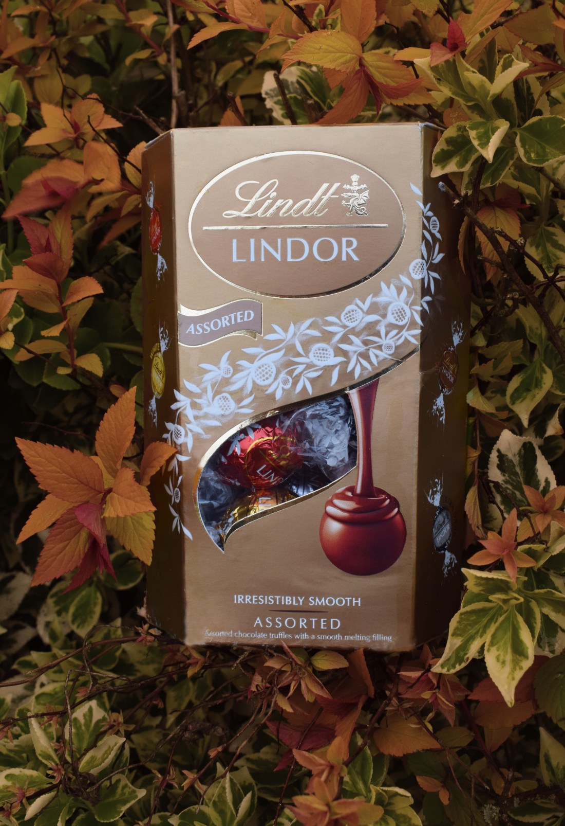
Image 4. (The chocolate)
Natural lighting. ISO- 200. Shutter speed- 160. Aperture- F8(?)
I again, took the image so that it was deemed desirable. The background was and is purely for the aesthetics of the box matching with the box. I brought out the light hitting the box and hitting the chocolate on the box just right.
The Constructed Image.
For the constructed image, I took the opportunity to use words in images as I believe that it realty brings out the meaning, such as, Willie Doherty’s images, which was a big inspiration to me throughout.i decided to use one words, getting straight to the point, making the
images appear slightly more mysterious to make the audience think, than writing a sentence.
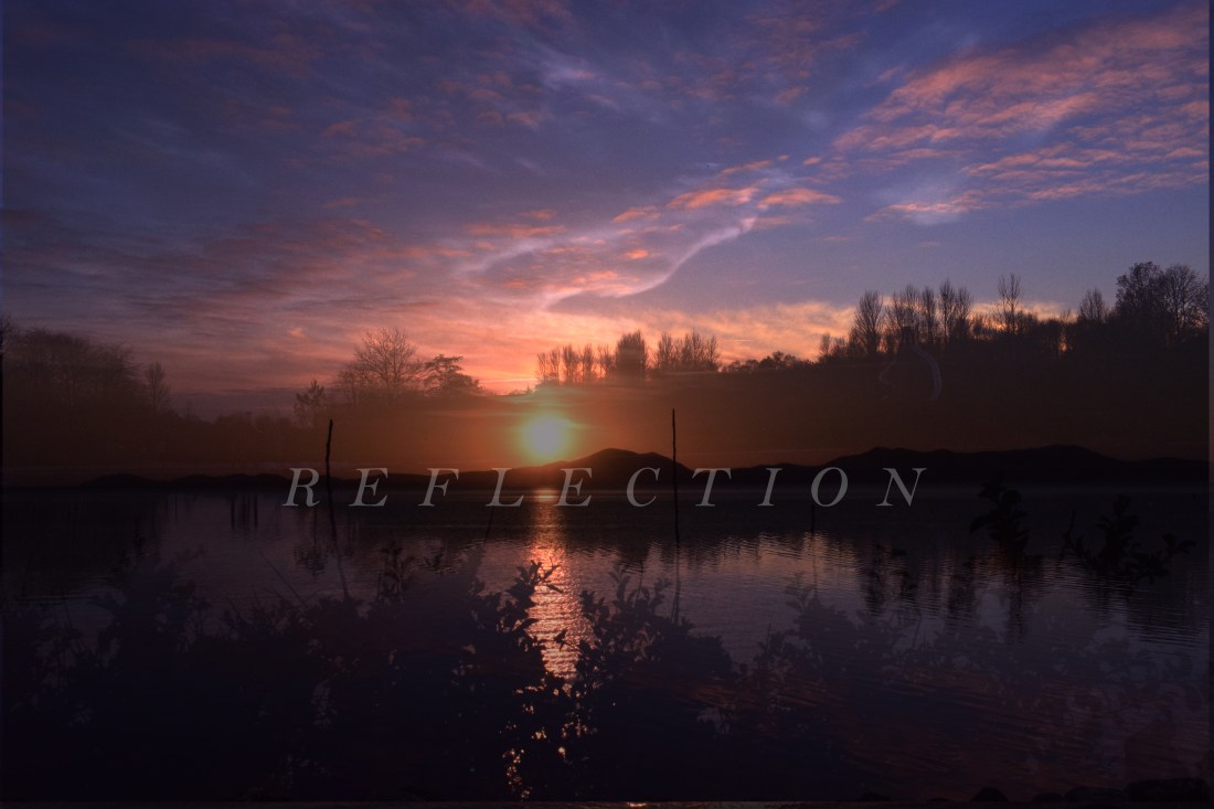
Image 1 (The reflection)
I took, at different times, two sunset images in different locations, and had decided to layer them together and lower the opacity so that the top image would blend better with the background image. I used these particular images due to the same colour tones One of the images was at the beach whereas the other was at a lake and so, I believe that they corresponded very well.
Both of them took at ISO – 200. Aperture – F5.6. Shutter Speed – 160.
The word “reflection” was the idea of the “literate” reflection with the sun, in juxtaposition with the deeper meaning, which was that people watch landscapes in wonder or sit and look at them, reflecting on whatever they have been going through at that time, which is really meaningful and shows true beauty in landscape that can be found, and it can happen anywhere, which was the idea of using two different sunset images.
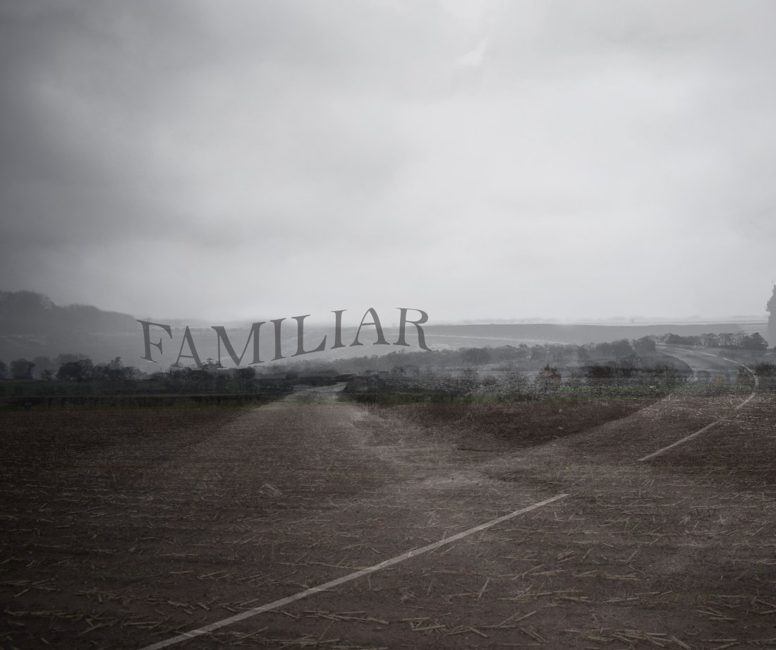
Image 2. (Familiar)
Black and white. Layered with 2 / 3 landscape images, all the same colour toning but all taken in different areas.
Originally, I wanted to use something involving direction, but instead as it turned out, I had decided on using something more personal to me, as these areas are extremely familiar to me, spending my childhood in many of these areas. The idea of them being in black and white is that they are a memory.
However, it could also be relating to other peoples situations, such as the audiences, to not know what direction they are facing within life.
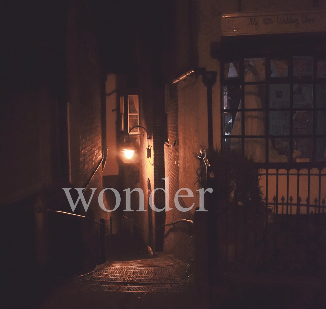
Image 3. (Wonder)
ISO- extremely high, I don’t remember the exact ISO but due to it being a darker area, I used a higher ISO. Aperture- 5.6, due to a lot of it being in focus. Shutter speed – 160.
This image is cropped with natural ambience.
This photograph is a town with ambient lighting, creating a warm vibe. This image can be seen to make a person wonder when they are looking at it, due to the windows curtains being half open, and the street that is eventually enveloped in darkness. However, due to the warm effect, it makes the image rather cosy, so, with this in juxtaposition, I used Wonder, as it does just that.
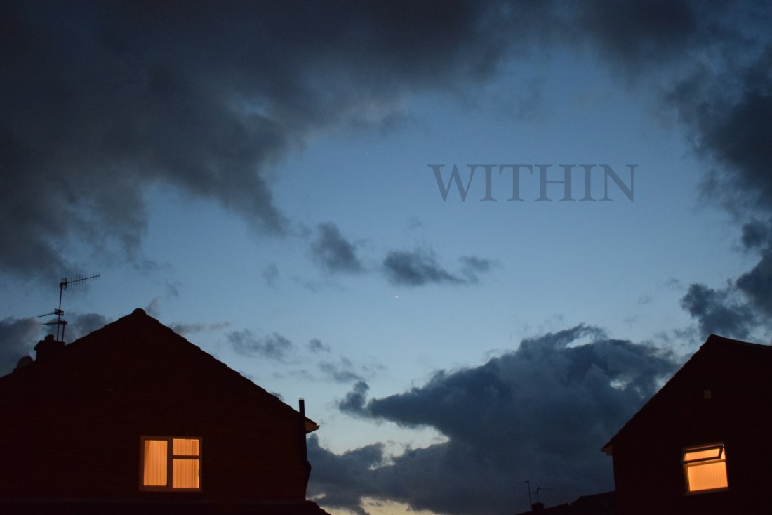
Image 4. (Within)
ISO- 400/ high, due to it yet again, being a shot taken in the evening. Shutter speed- 125/60. Aperture- F5.6.
This photograph, I, again, believe that there is a contrast between the sky, that is starry and appears quite bright, and the dark silhouetted houses with the set of ambient windows, making the image take a sinister turn. Throughout this project, I wanted to use, perhaps, “everyday” words that could be, when placed in image, quite interesting. I used “Within” due to the conspiquous houses and windows shining. What is within?
The Enigma of Time.
In this project, I used both natural locations and studio. Modern against vintage, the juxtaposition between them both to show that time has and will effect all generations, it includes memories and movement, not only in the body but in the person themselves. I wanted to evidentally created mysterious photographs, “The Enigma of Time”
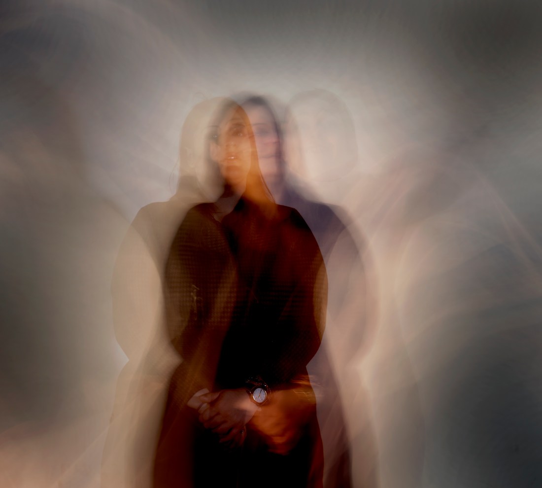
Image 1 (The modern clock)
Taken within the studio, a soft box and key light is being used.
ISO- 200. Shutter speed- 7 seconds. Aperture- F5.6/8.
Here, I wanted to create a slight modern, surreal image. I used shutter speed to add movement, and as it turned out, three faces from the same person, three different bodies came into light, with three different facial expressions. This showed both how time can be portrayed as confusing but also the modern look on society nowadays, with the different situations that people are put in nowadays. The watch was kept in focus, to show the Time.
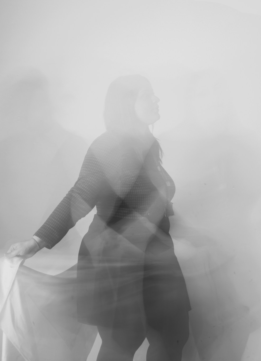
Image 2. (Ghostly dancer)
Again, studio lighting, soft box and key light.ISO- 200. Shutter speed – 7 seconds and Aperture was at F5.6/8.
This photograph is simply portraying movement, which was Bill Wadman inspired.
However, I also looked into the Enigma of time, and by keeping the face faded and out of the image, it creates an eery mysterious sense to it.
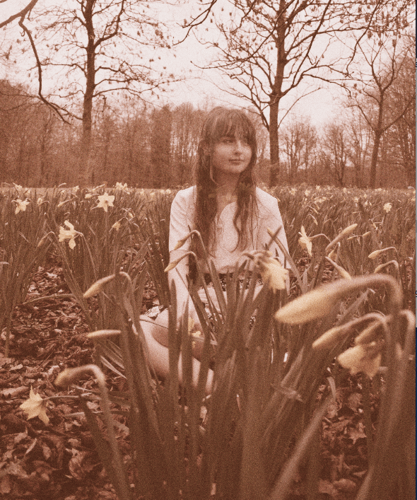
Image 3. (Vintage memories)
Natural lighting is used here. ISO – 200. Shutter speed- 160. Aperture- F8(?)
For this image, I wanted to create a vintage effect and did this by adding a sepia effect and adding on grain (or “noise) I originally wanted to have the idea of “they are a memory” with making the person in the photograph transparent.
The enigma of the photograph is the question of where they are looking at and why. The where are they. The when. Creating a rather ghostly effect.
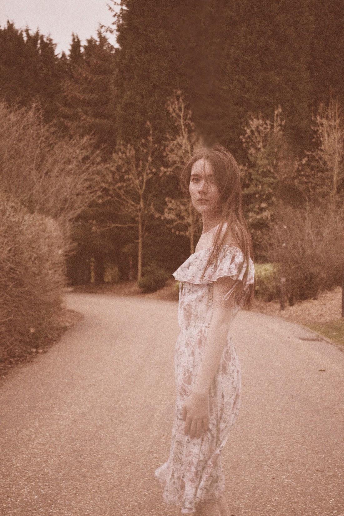
Image 4 (Vintages memoir)
Natural lighting. ISO-200. Shutter speed – 160. Aperture – F8.
This photograph also had the same meaning as the previous image, the idea of a transparent memory. However, this photograph is a little different due to the fact that the person within the image is looking directly at the camera, it is haunting and piercing. She has a blank expression. Rather personal, somewhat vunerable.
Even the background to the image creates up the idea of “The Enigma”, where does the path go? Where did she go? I wanted to created vintage inspired images.
Objects of Desire.
Image 1. (Perfume)
Here I used studio lighting (a soft box and a key light). My ISO was set at 200. My Shutter Speed was 1/125 and my Aperture was at around F8. I wanted to try advertisement in these images. I found it extremely confusing and tough to come up with ideas for this project but I had ended up deciding to take this project literally and take literate Objects of Desire and making the actual image desirable.
I wanted to use studio lighting to experiment with studio lighting and white balance, to make the image soft and have pastels involved, just as the photographers I researched. I decided to add flowers to give a visual representation of what the perfume smells like, with a sense of warmth to the photograph.
Image 2. (The purse)
Here, I used natural lighting. ISO: 200/100. (?) The shutter speed: 125/160. Aperture: about F11?
This is another image I wanted to make soft, I had used natural lighting. I wanted to have a delicate effect on the image due to the delicacy of the petals in the image, and due to the fact that the purse is in focus whereas the blossom is blurred out, creating more of a soft effect. The purse colours corresponded well with the colours from the nature surrounding it. It was created to become a desirable image. I had brightened the flowers for desire, with the idea of taking commercial out of the studio to bring natural effects.
Image 3. (The port.)
I again, used natural lighting. ISO – 200. Shutter speed – at about 125. Aperture – F5.6 / F8.
I wanted the lighting to be authentic from the beach, so I used natural lighting. I had taken the project literally, with the word “desirable”, a desirable drink at the beach. I used the Vantage Point well and tried to make it so that the sun was hitting directly through the bottle. Furthermore, I think the motion from the waves was also a clever way to make the image rather personal.
Image 4. (The chocolate)
Natural lighting. ISO- 200. Shutter speed- 160. Aperture- F8(?)
I again, took the image so that it was deemed desirable. The background was and is purely for the aesthetics of the box matching with the box. I brought out the light hitting the box and hitting the chocolate on the box just right.
The Constructed Image.
For the constructed image, I took the opportunity to use words in images as I believe that it realty brings out the meaning, such as, Willie Doherty’s images, which was a big inspiration to me throughout.i decided to use one words, getting straight to the point, making the
images appear slightly more mysterious to make the audience think, than writing a sentence.
Image 1 (The reflection)
I took, at different times, two sunset images in different locations, and had decided to layer them together and lower the opacity so that the top image would blend better with the background image. I used these particular images due to the same colour tones One of the images was at the beach whereas the other was at a lake and so, I believe that they corresponded very well.
Both of them took at ISO – 200. Aperture – F5.6. Shutter Speed – 160.
The word “reflection” was the idea of the “literate” reflection with the sun, in juxtaposition with the deeper meaning, which was that people watch landscapes in wonder or sit and look at them, reflecting on whatever they have been going through at that time, which is really meaningful and shows true beauty in landscape that can be found, and it can happen anywhere, which was the idea of using two different sunset images.
Image 2. (Familiar)
Black and white. Layered with 2 / 3 landscape images, all the same colour toning but all taken in different areas.
Originally, I wanted to use something involving direction, but instead as it turned out, I had decided on using something more personal to me, as these areas are extremely familiar to me, spending my childhood in many of these areas. The idea of them being in black and white is that they are a memory.
However, it could also be relating to other peoples situations, such as the audiences, to not know what direction they are facing within life.
Image 3. (Wonder)
ISO- extremely high, I don’t remember the exact ISO but due to it being a darker area, I used a higher ISO. Aperture- 5.6, due to a lot of it being in focus. Shutter speed – 160.
This image is cropped with natural ambience.
This photograph is a town with ambient lighting, creating a warm vibe. This image can be seen to make a person wonder when they are looking at it, due to the windows curtains being half open, and the street that is eventually enveloped in darkness. However, due to the warm effect, it makes the image rather cosy, so, with this in juxtaposition, I used Wonder, as it does just that.
Image 4. (Within)
ISO- 400/ high, due to it yet again, being a shot taken in the evening. Shutter speed- 125/60. Aperture- F5.6.
This photograph, I, again, believe that there is a contrast between the sky, that is starry and appears quite bright, and the dark silhouetted houses with the set of ambient windows, making the image take a sinister turn. Throughout this project, I wanted to use, perhaps, “everyday” words that could be, when placed in image, quite interesting. I used “Within” due to the conspiquous houses and windows shining. What is within?
The Enigma of Time.
In this project, I used both natural locations and studio. Modern against vintage, the juxtaposition between them both to show that time has and will effect all generations, it includes memories and movement, not only in the body but in the person themselves. I wanted to evidentally created mysterious photographs, “The Enigma of Time”
Image 1 (The modern clock)
Taken within the studio, a soft box and key light is being used.
ISO- 200. Shutter speed- 7 seconds. Aperture- F5.6/8.
Here, I wanted to create a slight modern, surreal image. I used shutter speed to add movement, and as it turned out, three faces from the same person, three different bodies came into light, with three different facial expressions. This showed both how time can be portrayed as confusing but also the modern look on society nowadays, with the different situations that people are put in nowadays. The watch was kept in focus, to show the Time.
Image 2. (Ghostly dancer)
Again, studio lighting, soft box and key light.ISO- 200. Shutter speed – 7 seconds and Aperture was at F5.6/8.
This photograph is simply portraying movement, which was Bill Wadman inspired.
However, I also looked into the Enigma of time, and by keeping the face faded and out of the image, it creates an eery mysterious sense to it.
Image 3. (Vintage memories)
Natural lighting is used here. ISO – 200. Shutter speed- 160. Aperture- F8(?)
For this image, I wanted to create a vintage effect and did this by adding a sepia effect and adding on grain (or “noise) I originally wanted to have the idea of “they are a memory” with making the person in the photograph transparent.
The enigma of the photograph is the question of where they are looking at and why. The where are they. The when. Creating a rather ghostly effect.
Image 4 (Vintages memoir)
Natural lighting. ISO-200. Shutter speed – 160. Aperture – F8.
This photograph also had the same meaning as the previous image, the idea of a transparent memory. However, this photograph is a little different due to the fact that the person within the image is looking directly at the camera, it is haunting and piercing. She has a blank expression. Rather personal, somewhat vunerable.
Even the background to the image creates up the idea of “The Enigma”, where does the path go? Where did she go? I wanted to created vintage inspired images.